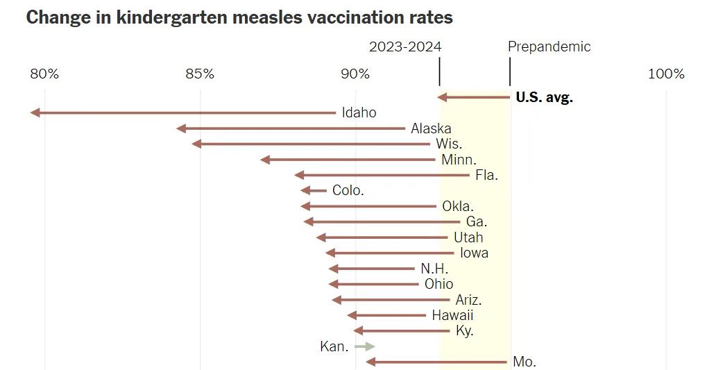
Percent change is the difference between the two values divided by the initial or baseline value.
Percentage point difference is the difference between two percentages.
For both calculations, if positive, the values are increasing; if negative, the values are decreasing; and if zero, there is no change in the value.
In the Vaccination graph, the percent change is calculated by subtracting the prepandemic value (or baseline value) from the 2023 – 2024 value and then dividing by the prepandemic value and then multiplying this by 100 to change a decimal into a percentage. For Idaho, this change is -11.9% (100 (.79 – .89)/.89). The percentage point difference is -10% (100(.79 – .89)). Without doing these calculations, for Idaho, we can easily see from the graph that the rate has declined because the arrowhead is pointing in a negative direction and because it is brown. For all states except Kansas, Alabama, Maine and Connecticut, we can see that the percentage change is negative, indicating that for 46 states, vaccination rates from before the pandemic to 2023 -2024 declined or stayed the same. For the four other states, the arrows are pointing in a positive direction and the lines are green.
The graph for “What’s Going On in This Graph?” was selected in partnership with Sharon Hessney. Ms. Hessney wrote the “reveal” and Stat Nuggets with Roxy Peck, a professor emerita of statistics at California Polytechnic State University, San Luis Obispo, and moderates online with Traci Higgins, a data science educator at TERC in Cambridge, Mass.
More?
• See all graphs in this series or collections of 75 of our favorite graphs, 28 graphs that teach about inequality and 24 graphs about climate change.
• View our archives that link to all past releases, organized by topic, graph type and Stat Nugget.
• Learn more about the notice and wonder teaching strategy from this 5-minute video and how and why other teachers are using this strategy from our on-demand webinar.
• Sign up for our free weekly Learning Network newsletter so you never miss a graph. Graphs are always released by the Friday before the Wednesday live moderation to give teachers time to plan ahead.
• Go to the American Statistical Association K-12 website, which includes teacher statistics resources, Census in the Schools student-generated data, professional development opportunities, and more.
Students 13 and older in the United States and Britain, and 16 and older elsewhere, are invited to comment. All comments are moderated by the Learning Network staff, but please keep in mind that once your comment is accepted, it will be made public.

