TIME SERIES STEP GRAPH
A time series step graph, sometimes called a staircase or piecewise graph, has one y-axis value over an x-axis time interval, “stepping” from one time period interval to the next interval. It is used when the data exists for distinct periods of time, like a week, year or decade.
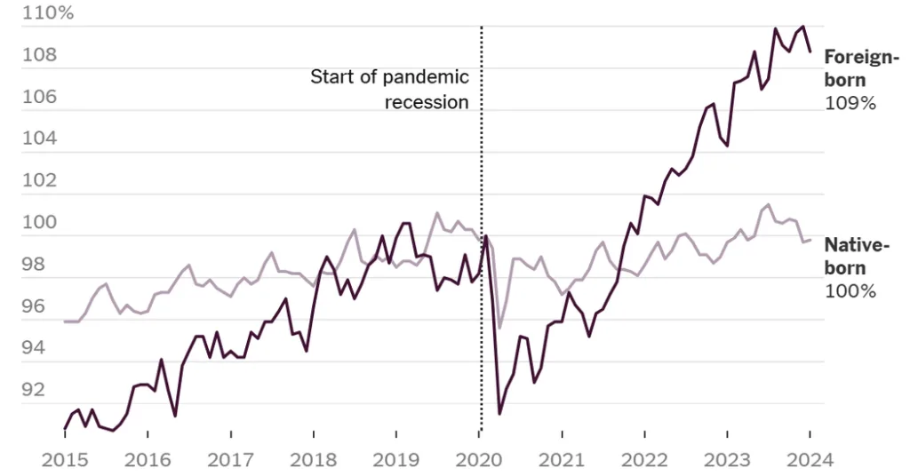
In the U.S. Foreign-Born Population time series step graph, the horizontal “steps” (riser and tread) are five years in duration from 1850 to 2020 and monthly thereafter. The vertical “risers” show the change in the percentage of the U.S. population that is native-born or foreign-born from the prior five year period. From the graph, it is easy to see the increase in foreign-born population was greatest from 1850 to 1860, a period of economic expansion prior to the Civil War, and from 1990 to 2000, a period at the end of the Cold War and of the rise of new technologies including the internet. The decline in the percentage of the population that is foreign-born was greatest from 1930 to 1940 — the Great Depression.
BUBBLE COMPARISON CHART
A bubble chart is a type of graph that displays the value of a quantitative variable as a bubble. The area of the bubble is proportionate to the value of the variable.
In the Immigrant bubble chart, the area of the bubbles are proportional to the size of the immigrant group by category. Bubbles with a dashed circumference are estimates.
The graph for “What’s Going On in This Graph?” was selected in partnership with Sharon Hessney. Ms. Hessney wrote the “reveal” and Stat Nuggets with Erica Chauvet, a mathematics professor at Waynesburg University in Pennsylvania, and moderates online with Annie Fetter, a creator and promoter of the “What do you notice? What do you wonder?” teaching strategy from Philadelphia.
More?
• See all graphs in this series or collections of 75 of our favorite graphs, 28 graphs that teach about inequality and 24 graphs about climate change.
• View our archives that link to all past releases, organized by topic, graph type and Stat Nugget.
• Learn more about the notice and wonder teaching strategy from this 5-minute video and how and why other teachers are using this strategy from our on-demand webinar.
• Sign up for our free weekly Learning Network newsletter so you never miss a graph. Graphs are always released by the Friday before the Wednesday live moderation to give teachers time to plan ahead.
• Go to the American Statistical Association K-12 website, which includes teacher statistics resources, Census in the Schools student-generated data, professional development opportunities, and more.
Students 13 and older in the United States and Britain, and 16 and older elsewhere, are invited to comment. All comments are moderated by the Learning Network staff, but please keep in mind that once your comment is accepted, it will be made public.

